
Hi, if you don’t know me, I’m Dr Theresa Orr.
You’re welcome to learn more about how I help students succeed at university with my Uni Pro Accelerator Course.
As a researcher and lecturer, I’ve seen so many students struggle to write good literature reviews because they end up just summarizing articles instead of critically analyzing them. But there’s one simple step that makes writing literature reviews so much easier:
Every literature review should include an image. Creating a graph or a map image from data collected during your review will make your literature review easier to write, and will guarantee you a great mark
You can also watch my video on how to create a graph or image for literature reviews here:
Why An Image Works
Creating an image for your literature review will:
- Improve the readability of your review.
- Help you get the marks for depth of research, because you’re showing connections between concepts (not just restating what authors said).
- Make writing your literature review easier
- Impress your lecturer, because you’re giving real insights instead of writing a “he said / she said” summary.
When you create an image, you’re forced to:
- Pull information together from different sources.
- Look for patterns, changes, or gaps in the research.
- Present the bigger picture in a way that’s easier to see than in paragraphs of text.
How to Create Your Literature Review Image
1. Pick one key piece of information
You’ll collect this data from each study as you review them, so it’s important to decide before you start reading what you’re looking for. That way, you won’t waste time going back through articles again.
Here’s some examples of key pieces of information you can collect:
- Year of publication → useful for showing how research has changed over time.
- Location of the study → perfect for making a map and spotting geographic gaps.
- Sample size → shows whether studies are based on small groups or large populations.
- Method used (e.g., survey, experiment, interview) → highlights strengths and weaknesses in research approaches.
- Population studied (e.g., age group, gender, cultural background) → helps show diversity or lack of it.
- Main variable measured (e.g., rainfall, temperature, anxiety scores, exam results).
- Outcomes/results (e.g., positive/negative effect, strength of relationship).
💡Tip
The trick is to choose one thing that matters for your research question and then collect that consistently across all the articles you review.
A good test is to ask yourself:
- Can I put this into one column in a spreadsheet?
- Will it look consistent across studies?
- Will comparing it help me spot patterns, trends, or gaps?
If the answer is “yes,” you’ve chosen a good key piece of information.
❌ Examples of Key Information to Avoid
Just like there are pieces of information that will be helpful for your literature review, there are some that are downright dreadful and will make your life much harder. So avoid these:
- “Everything that’s important” → way too vague. You’ll end up trying to capture too much and overwhelm yourself.
- “The whole conclusion of the article” → conclusions are often long and cover multiple points, so you won’t be able to compare across studies.
- “Study findings” (without narrowing what kind) → too broad, every study has lots of findings, and you won’t see patterns.
- “Author opinions” → subjective and inconsistent, makes comparison impossible.
- “Full abstract” → you’ll just be copy-pasting summaries instead of actually analysing.
- “The introduction/background” → these are often context, not actual data, so they don’t help with synthesis.
- “References used” → irrelevant for your own review unless you’re doing a citation analysis.
2. Organise it in a spreadsheet.
Once you know what information you’re collecting, the easiest way to keep it organised is in a simple spreadsheet.
- Column 1: Author name
- Column 2: Year of publication
- Columns 3+: Your key information (e.g., rainfall, temperature, sample size, location).
Example
Here’s an example of data collected for my literature review on climate data using the location of each study, and including the authors name and year of publication.
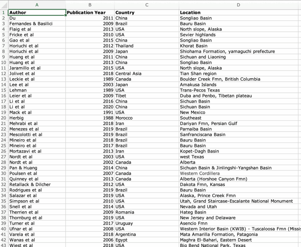
A spreadsheet lets you line up studies side by side so you can quickly spot patterns, trends, and gaps (which is what you will then write about in your literature review).
💡Tip
Keep your spreadsheet simple. Don’t try to record everything from each study, just the key information you decided on earlier.
- If you’re not great with Excel, Google Sheets works perfectly and has built-in graph tools.
- Use short words or codes (e.g., “Exp” for experiment, “Surv” for survey) so it’s easy to scan.
- Separate the author name and year into different columns. This makes it easier to sort by time later.
3. Turn your spreadsheet into a graph or map.
Once you’ve collected your data in a spreadsheet, the next step is to turn it into a image. Data is much easier to understand when you can see it. By turning your spreadsheet into a graph or map, you’ll spot trends and gaps that would be invisible if you only described them in text. But most importantly, once you can see the pattern in the data, you can write about it. It’s incredibly hard to write literature reviews when you can’t “see” the data visually.

The two best type of images for literature reviews are:
- Graphs can show changes over time (great for spotting trends), differences between groups (e.g., age, gender, or treatment types), or even relationships between variables (e.g., study hours vs exam scores).
- Maps can show where research has been done (coverage across locations), highlight gaps in certain regions, or compare differences between areas (e.g., urban vs rural, coastal vs inland).
Examples of Images
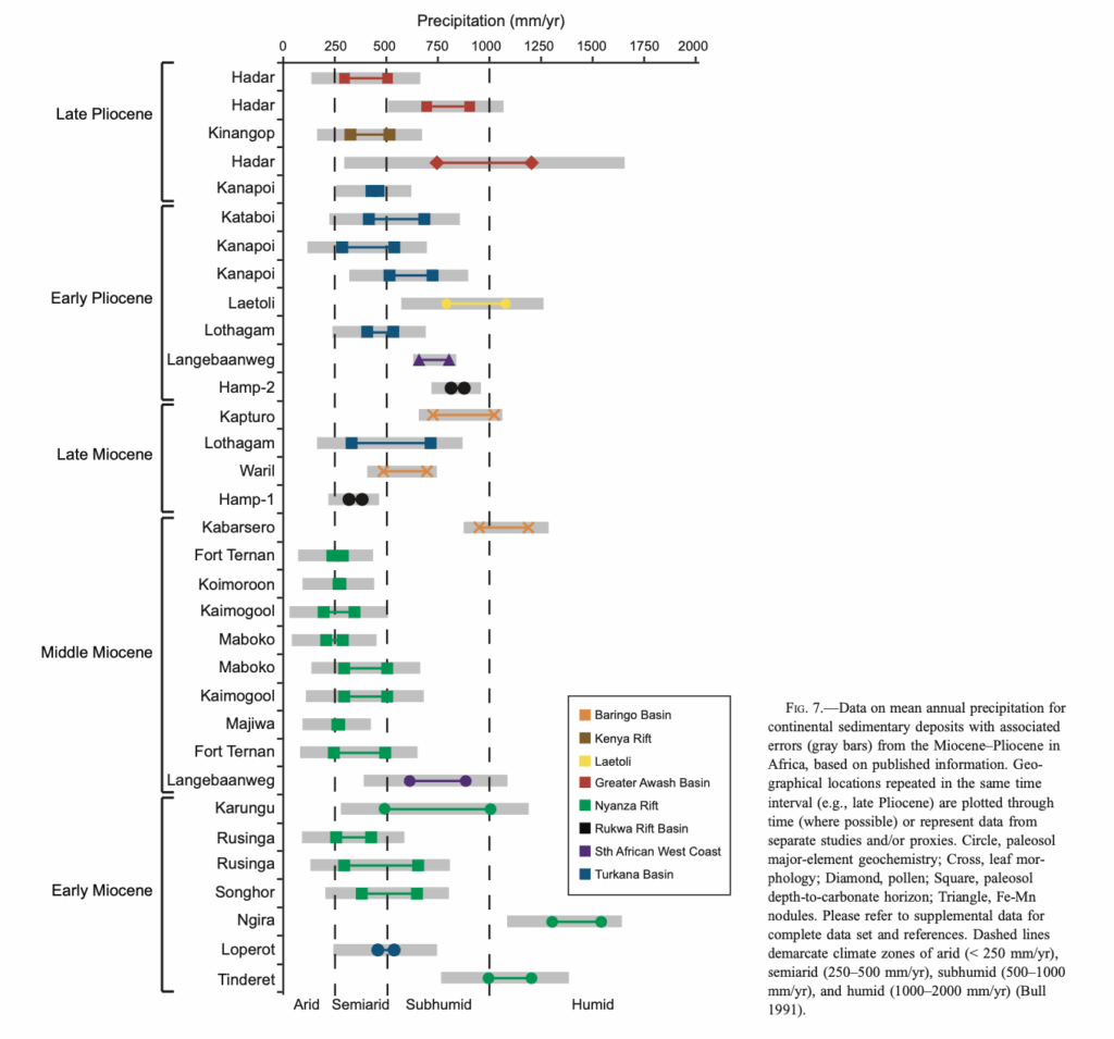
- Graph Example: Rainfall data in East Africa plotted through time. You can instantly see wet vs dry periods that would be invisible in text alone (and very hard to explain). I collected this data for a broader research project and it helped me to write the paper much faster.
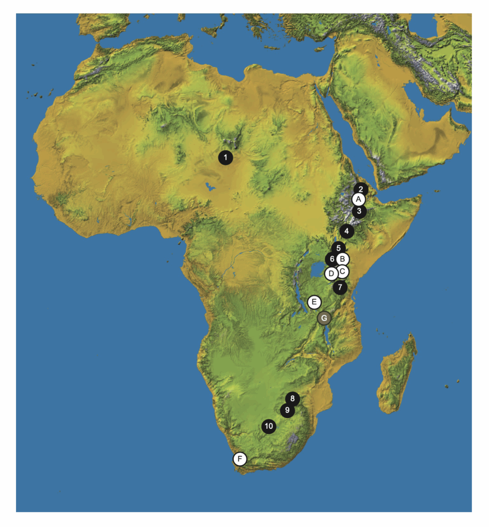
- Map Example: Locations where fossils were found across Africa. This image instantly shows a gap in certain regions where little research has been done (or no fossils have been found). I used this image to show my study helped to fill a gap moving north to south in Eastern Africa.
Your image doesn’t have to be fancy. It just needs to show connections that aren’t obvious if you only describe studies in words.
💡Tip
If you’re not sure what kind of image to make:
- Look at published literature reviews in your field and see what kind of figures they use.
- Remember: your image doesn’t need to be complex. Even a simple bar chart or map can show patterns that text alone can’t.
How to Write About Your Image
Once you’ve created your image, writing your literature review becomes much easier:
- Describe the patterns you see → increases, decreases, clusters, gaps.
- Link back to the studies → cite the sources you pulled the data from.
- Highlight what’s missing → this is where you show critical analysis.
Instead of writing “Smith (2020) found X, Johnson (2023) found Y,” you’re now saying:
“Research shows a clear increase in rainfall in East Africa from the Miocene to the Pliocene (Smith, 2020; Johnson, 2023). However, there are few studies capturing the changes within each age, leaving a major gap in understanding how rainfall shifted in these important periods.”
By creating an image, you’ve already done the synthesis and critical analysis your lecturer is looking for. Writing the review becomes as simple as explaining your image, and that’s how you turn a standard literature review into an exceptional one.
For more help on how to synthesize instead of summarize read this next.
